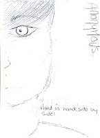
This was my rough sketch idea of a possible design we could have chosen to use for out film poster.
I decided to use an extreme close up of the side of his face, I chose to do this as I thought that it would show the bruising around his eye and knew I could change the complexion of his skin to make the idea of social realise obvious to the audience. Also with the image being an extreme close up it would not give the storyline away as the setting and location in not shown in the poster. Though I was not certain where exactly the title would be place I thought that it would be best to show it at the top of the poster in a bold font the show it clearly to the audience. I think this poster would work very well as it is simple but shows a little of that the film could be about.
No comments:
Post a Comment